
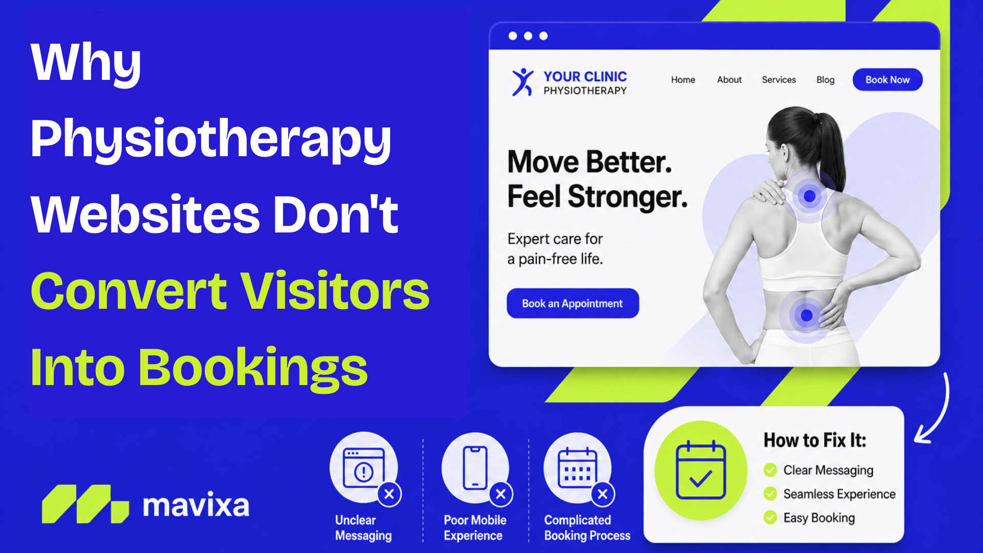
A physio clinic website getting decent traffic but almost no bookings is one of the more frustrating problems in this industry, because on paper everything looks fine. The site exists, people are finding it through Google, and the calendar still is not filling up. The traffic was never really the problem. What happens between the click and the booking is.
The gap is bigger than most owners expect
Healthcare websites convert visitors into enquiries or bookings at a rate that most other industries would find alarming. Figures cited across healthcare marketing research generally sit in the two to five percent range, meaning that out of every hundred people who land on a clinic website, somewhere between ninety five and ninety eight leave without calling, filling a form, or booking anything. This range gets repeated a lot across marketing blogs without a single clean source behind it, so it is worth treating as a general industry pattern rather than a precise number, but the direction of it lines up with what most clinic owners already sense when they check their own analytics.
What is better documented is why that gap exists in the first place, and speed is one of the clearest, most measurable reasons.
Speed is not a technical detail, it is a booking decision
Google, working with performance analytics company SOASTA, ran one of the largest studies of its kind on mobile web behaviour, analysing over nine hundred thousand mobile landing pages. The finding was blunt. As load time increases from one second to three seconds, the probability of a mobile visitor leaving the page before it finishes loading rises by 32%. Push that to five seconds and the number climbs sharply again. A separate, later version of the same research, expanded to eleven million mobile pages across more than two hundred countries, found that bounce probability rises 123% as load time stretches from one second to ten.
For a physio clinic, this matters more than it sounds like it should, because most physio website traffic is mobile. Someone searching "physio near me" with a sore back is doing it on their phone, standing in a kitchen or sitting in a car, not at a desk. If the site takes five or six seconds to load a hero image before they can even see a phone number or a booking button, a meaningful share of them are gone before the page has finished rendering. No amount of good copy or trust building fixes a problem that happens before the visitor sees any of it.
The booking form is usually where the rest disappear
Assuming someone does stay on the page, the next drop off point is almost always the booking or enquiry form itself. This is one of the more consistent findings across web usability research generally, not just healthcare specifically. Every additional field on a form costs completions. Forms asking for name, phone, email, date of birth, preferred practitioner, appointment type, referral source and a written description of the issue are common on clinic websites, and every one of those fields is a small extra reason for someone in pain to give up and just call a different clinic instead, assuming the clinic even answers the phone quickly.
There is also a trust problem that shows up right at the point of booking. A visitor who has scrolled past generic stock photography and vague service descriptions, then arrives at a form with no practitioner names, no real clinic photos and no indication of what actually happens after they submit it, has very little reason to follow through. Healthcare decisions carry more hesitation than most online purchases, and a website that does not address that hesitation right where the booking happens loses people it had already half convinced.
Where AI integration actually helps, and where it does not
This is the point where a lot of clinics jump straight to "we need a chatbot," which is not quite the right framing. A chatbot bolted onto a slow, confusing website does not fix the site, it just adds another box to click on a page people are already trying to leave.
Where AI integration genuinely moves the needle is when it replaces the long form entirely, rather than sitting next to it. Instead of a visitor filling in eight fields and hoping someone gets back to them, an AI system built into the site can ask a few natural questions the way a receptionist would, understand what the person actually needs, and book them directly into an available slot in the same conversation. That collapses a multi step form into something closer to a two minute exchange, which addresses the exact form abandonment problem described above, not by making the form prettier but by removing most of it.
The same integration also catches the visitors who were never going to fill in a form at all. A lot of people browsing a physio website at night are not ready to commit to a booking, they just want a quick answer to something like whether the clinic treats a specific injury or what a first session involves. Without something there to answer that in the moment, they leave and the enquiry never gets logged anywhere. An AI system that can answer those questions directly on the site, and quietly capture the enquiry even if they do not book straight away, turns a chunk of that silent drop off into something the clinic can actually follow up on. This is the same principle behind Mavixa's AI Front Desk process, applied directly on the website instead of only over the phone.
What is actually worth checking on your own site
Before assuming the fix is a full redesign, it is worth checking three things specifically. First, how long the site actually takes to load on a phone using a normal 4G connection, not office wifi, since Google's own PageSpeed Insights tool will show this for free. Second, how many fields the booking form asks for, and whether every one of them is genuinely needed before the first conversation happens. Third, whether someone landing on the site at 9pm with a question has any way to get an answer at all, or whether the only options are a form that will be checked tomorrow or a phone line that is already closed.
None of these are expensive fixes individually. Compressing images and simplifying a form can often be done in a single afternoon. The bigger, more durable fix is rethinking the booking step itself, and that is where combining a redesigned, fast loading site with an AI system that handles the conversation instead of a static form tends to close the widest part of the gap, since it addresses both the speed problem and the friction problem at the same time instead of treating them separately.